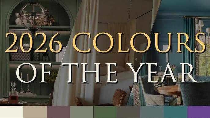
Color has always been one of the quietest yet most powerful storytellers in our lives, but 2026 is set to turn up the volume. Instead of relying on predictable neutrals and safe pastels, designers, brands, and homeowners are gravitating toward shades that feel emotional, intelligent, and boldly future-facing.
From transformative teals that bridge tech and nature to digital lavenders designed for an AI-first world, this year’s palette is less about decoration and more about how we want to feel and live. In this article, we’ll explore seven unexpected color trends that are not only breaking through in 2026 but also reshaping wardrobes, interiors, and digital spaces in surprisingly practical ways.
1. Transformative Teal: The New Power Neutral
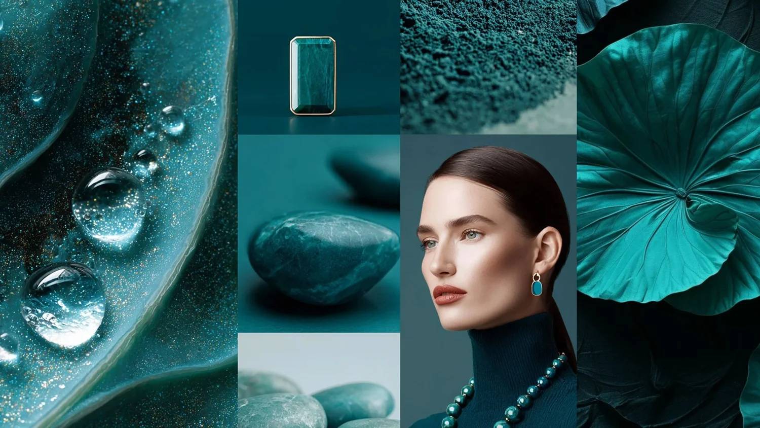
Trend agencies highlight Transformative teal as a key 2026 hue, positioned between blue and green to signal reorientation and change. It feels both digital and natural at once, which is why it’s showing up in interiors, fashion, and UI design.
How it will appear
● In interiors: Wall paints and accent chairs in deep teal as a calmer, more sophisticated upgrade from plain navy.
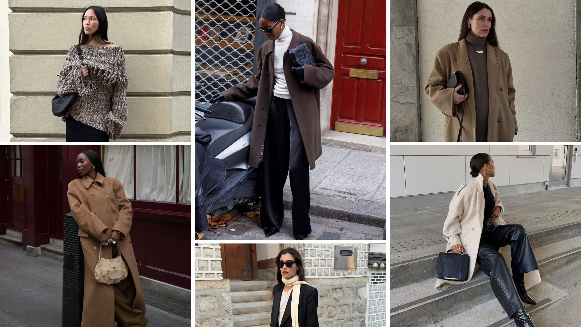
● In fashion: Tailored suits, outerwear, and handbags in teal replacing classic black or camel as a statement neutral.
● In digital/UI: Buttons, gradients, and dashboards that use teal to bridge tech minimalism and eco-conscious branding.
Why it resonates in 2026
● Symbolizes “reorientation” and the desire to reset cultural and environmental priorities.
● Psychologically, teal is perceived as trustworthy but less corporate than flat blue, ideal for new-era brands.
Quick styling ideas
● Pair with: Soft sand, warm white, and muted terracotta for a grounded palette.
● Avoid: Overloading teal with other strong digital neons; let it be the anchor shade.
2. Jelly Mint & Neo-Pastel Greens
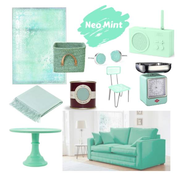
Forecasts for Spring/Summer 2026 spotlight “Jelly Mint,” a playful mint green that sits between nostalgic candy tones and fresh foliage. It’s softer than the “brat green” of recent years, but more electric than traditional sage.
Where you’ll see it
● Interiors: Kitchen cabinets, bathroom tiles, and accent rugs in minty greens for a fresh but not childish look.
● Fashion: Streetwear, sneakers, and accessories, especially in monochrome mint outfits or with white and silver.
● Beauty: Sheer mint eyeliners, nail polish, and subtle highlighters as an alternative to pastel blue.
Why it feels unexpected
● Pastel greens used to be “nursery only”; in 2026 they’re pushed into serious design and luxury spaces.
● The color links wellness and playfulness, aligning with the rise of “joyful minimalism” rather than stark minimalism.
Practical tips
● Combine Jelly Mint with: Charcoal, tobacco brown, or brushed metal to keep it grown-up.
● Use it as: A focal kitchen island, a hero sneaker color, or a primary accent in app interfaces.
3. Amber Haze & Uplifting Ochres
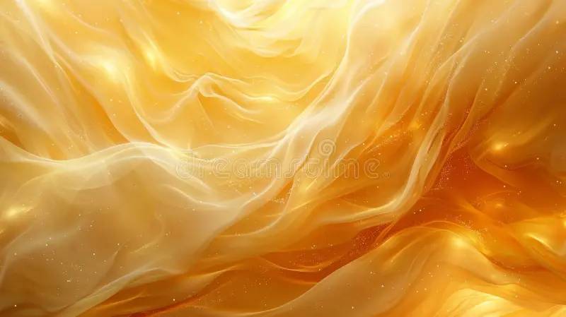
Forecasts highlight “Amber Haze,” a warm amber-yellow that feels sunlit rather than neon, echoing a wider shift toward nurturing, earthy yellows. Interior experts also expect ochre and butter-style yellows to surge in 2026 as people seek optimism at home.
Real-world applications
● Interiors: Ochre walls, amber velvet sofas, and yellow-toned appliances that add warmth without high saturation.
● Fashion: Amber knits, suede boots, and bags that function like a richer camel.
● Branding: Food, wellness, and travel brands using amber as a “sunrise” signal of comfort and renewal.
What makes it different from past yellows
● Less acid, more earthy: closer to turmeric, honey, or late-afternoon light than to “highlighter” yellow.
● Seen as a bridge tone between nostalgic 1970s palettes and contemporary eco-conscious design.
Use it smartly
● Pair with: Deep greens, off-whites, and textured woods for a grounded scheme.
● Keep it in: Upholstery, artwork, and textiles if you’re unsure about full walls or head-to-toe outfits.
4. Electric Fuchsia & Dopamine Brights
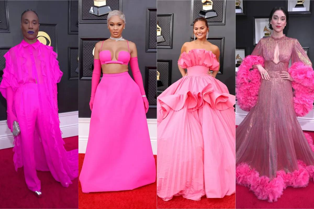
“Electric Fuchsia” is singled out as a key SS26 shade, capturing high energy and a sense of urgency. It taps into the dopamine-dressing mentality but is moving from runway novelty into interiors and digital design.
Where it breaks through
● Fashion: Statement dresses, heels, and micro-bags in searing pinks that sit between neon and magenta.
● Interiors: Accent chairs, glassware, or art pieces in fuchsia used sparingly against calmer backdrops.
● Digital: Call-to-action buttons, campaign landing pages, and social-first visuals aimed at younger audiences.
Why it matters in 2026
● Reflects a cultural appetite for visible emotion and bold self-expression, after years of muted palettes.
● Trend analysts note that intense brights signal urgency around social and environmental change.
Usage guidelines
● Treat Electric Fuchsia as a “highlighter pen”: one strong stroke, not the whole page.
● Balance with: Soft greys, navy, or bare wood so spaces and outfits don’t feel chaotic.
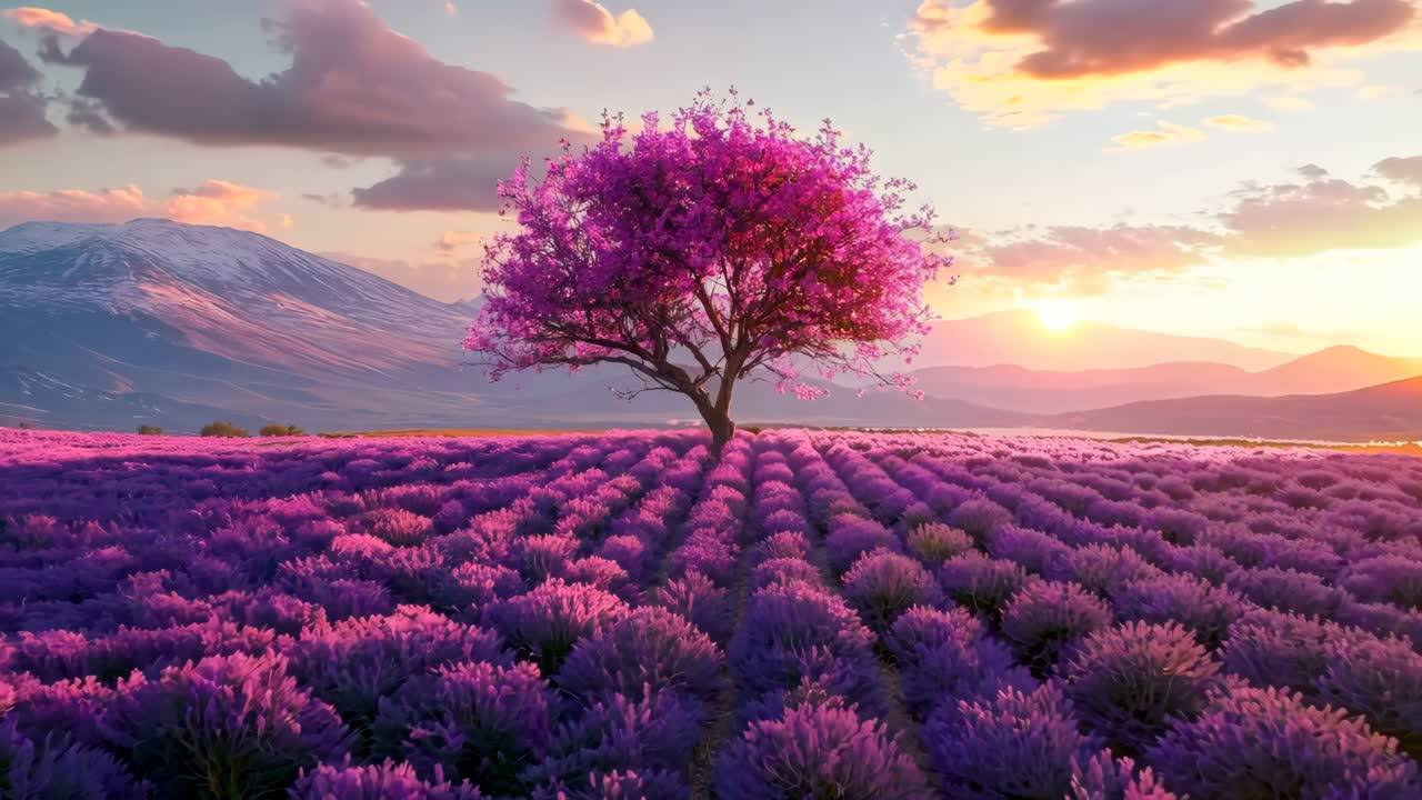
5. Rich Plums, Future Dusk & Neo-Purples
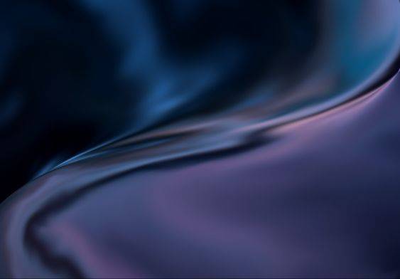
After years of cautious use, saturated purples—plum, aubergine, and the forecasted “Future Dusk” family—are poised for a 2026 comeback. Designers describe plum and purple as the next step for those already comfortable with saturated reds, greens, and yellows.
How they will show up
● Interiors: Plum walls in dining rooms, velvet sofas, and layered textiles for a cocooning, nostalgic mood.
● Fashion: Eveningwear, suiting, and leather goods in deep purple as a sophisticated alternative to black.
● Beauty: Wine-toned lipsticks and plum blushes replacing ultra-neutral palettes.
Why this feels fresh, not royal or gothic
● The focus is on “smoky” twilight purples rather than jewel-box violet, which reads softer and more modern.
● These colors are being combined with chalky pastels and warm neutrals instead of metallic gold, changing the overall narrative.
Tips for integrating
● Pair plum with: Amber, clay, and olive to create a warm, almost cinematic palette.
● Start small: Try cushions, artwork, and rugs before committing to full walls or tailored sets.
6. Deep Earthy Greens & the Rise of Olive
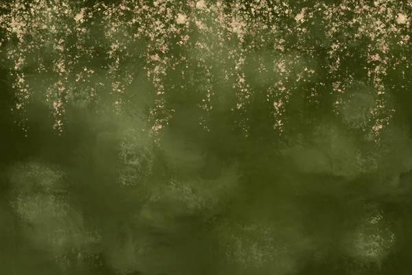
Designers expect deep, earthy greens to be the “enduring color” of 2026 interiors, moving on from light sages. Fashion buyers similarly point to olive green as the new versatile neutral, evolving from military tones to something more refined.
Where it dominates
● Interiors: Cabinetry, wall colors, and upholstery in deep forest or olive greens for a retreat-like feel.
● Fashion: Outerwear, trousers, and knitwear in olive that can be styled like black, navy, or beige.
● Product design: Tech accessories, packaging, and lifestyle goods in muted greens to signal sustainability.
Why it’s unexpectedly mainstream
● Clients increasingly ask for spaces that feel restorative and “connected to outdoors,” pushing darker, soil-like greens.
● Olive green works across seasons and skin tones, which boosts its adoption in ready-to-wear collections.
How to work with it
● Combine with: Amber, cream, and chocolate brown for a comforting, grounded palette.
● Use matte, textured finishes (limewash, boucle, brushed fabric) to avoid a flat, military feel.
7. Digital Lavender & Synthetic Naturalism
Color analysts describe “Synthetic Naturalism” as a defining 2026 theme: pairing AI-inspired shades like Digital Lavender with earthy tones. Digital Lavender has already been flagged as a key future color because it balances rational blues and empathetic pinks.
Where you’ll notice it
● Interfaces: AI tools, wellness apps, and productivity dashboards using lavender gradients for calm, long-session use.
● Interiors: Bedding, lighting, and accessories in soft lavender as a gentler alternative to grey and stark white.
● Fashion: Loungewear, tailoring, and occasionwear that use lavender as the main color, not just a spring accent.
Why it’s more than “another pastel”
● Digital Lavender is engineered to feel emotionally safe in high-tech contexts, which fits an AI-saturated world.
● When paired with browns, terracotta, and deep greens, it creates a surprisingly grounded, grown-up palette.
Ways to experiment
● Try lavender in: Bed linens, ceramic lamps, or knit sets before moving into wall color.
● Combine with: Olive, clay, and off-white for a “soft sci-fi meets nature” mood that feels very 2026.
Putting It All Together: How To Use These 7 Colors
Think of 2026’s palette as a conversation between tech, emotion, and ecology. The seven key directions—Transformative Teal, Jelly Mint, Amber Haze, Electric Fuchsia, Rich Plums, Deep Earthy Greens, and Digital Lavender—offer a toolkit rather than a single “it” shade.
A few practical combinations
● Calm future home: Transformative Teal + Jelly Mint + warm white + pale wood.
● Moody luxe: Rich Plum + Deep Earthy Green + Amber Haze accents.
● Digital optimism: Digital Lavender + Electric Fuchsia (as a highlight) + soft grey.
If you’re updating your wardrobe, home, or brand in 2026, pick one of these colors as your hero shade and then build a small supporting cast around it, rather than chasing every trend at once.
Bottom Line
As these seven color stories show, 2026 is not about abandoning calm minimalism or embracing chaos for the sake of trend. Instead, it’s about choosing hues that carry meaning colors that can signal optimism, comfort, rebellion, or quiet focus, depending on how you use them. Whether you’re planning a wardrobe refresh, rethinking your living room, or designing a brand that feels current yet timeless, each of these shades can become a strategic tool rather than a fleeting fad. If you pick just one hero color that resonates with your lifestyle and layer it thoughtfully into your world, you’ll not only tap into the spirit of 2026, you’ll also create spaces and looks that still feel relevant long after the trend cycle has moved on.
Post Comment
Be the first to post comment!